There are two cases when you would want auto-resizing YouTube videos -
- You are changing your site to a responsive layout and all existing content should self-adjusts according to the browser window size.
- You are creating a new site and want all new embedded videos to be auto-resizing.
Google for "auto resize youtube video" and you will find lots of sites explaining the traditional solution - Wrap the iframe in a new div with a bottom padding of 56.25% and make the height & width of the iframe to be 100%. There are three problems with this solution -
- You need to find and change all your existing video embeds and change the code.
- For new videos, you need to remember to insert them in the new format.
- The "56.25%" is actually the aspect ratio of the video. Although most newer videos fall in this category, others would not display properly.
Making Youtube Videos Responsive Without Changing Code.
Here's the ideal solution where you need not change any existing code. All you need to do is to insert a few lines of javascript and all your embedded YouTube videos will automatically become responsive.
REQUIREMENT: This javascript based solution requires Jquery. So please add the following lines in your header first.
<script src="//ajax.googleapis.com/ajax/libs/jquery/1.9.0/jquery.min.js"></script>
Will adding Jquery decrease my site performance? Well, not really. The minified and zipped Jquery file only has a total size of around 31Kb. Also since Jquery is loaded from Google directly, chances of the visitor's browser already having Jquery in it's cache via some other site is very high. In short, Jquery is really light and would not need to be loaded again for your pages most of the time and the performance impact is near zero.
Now you need to load the actual code which makes the embedded videos auto-resizing. There are two ways to do this.
1. Include a javascript having the magic function in your pages. You can add the following lines in your page header.
<script src="https://cdn.rawgit.com/skipser/youtube-autoresize/master/youtube-autoresizer.js"></script>
2. If you are not comfortable adding yet another javascript, you could just copy the content to one of your own .js files. Here's the code you need to copy-
/*
 * Youtube video auto-resizer script
 * Created by Skipser.com
*/

$(document).ready(function() {
  if(typeof YOUTUBE_VIDEO_MARGIN == 'undefined') {
    YOUTUBE_VIDEO_MARGIN=5;
  }
  $('iframe').each(function(index,item) {
    if($(item).attr('src').match(/(https?:)?\/\/www\.youtube\.com/)) {
      var w=$(item).attr('width');
      var h=$(item).attr('height');
      var ar = h/w*100;
      ar=ar.toFixed(2);
      //Style iframe
      $(item).css('position','absolute');
      $(item).css('top','0');
      $(item).css('left','0');
      $(item).css('width','100%');
      $(item).css('height','100%');
      $(item).css('max-width',w+'px');
      $(item).css('max-height', h+'px');
      $(item).wrap('<div style="max-width:'+w+'px;margin:0 auto; padding:'+YOUTUBE_VIDEO_MARGIN+'px;" />');
      $(item).wrap('<div style="position: relative;padding-bottom: '+ar+'%; height: 0; overflow: hidden;" />');
    }
  });
});
If you want to add some margin on the sides of your video, just add the following line immediately above the javascript line or the code and replace "10" with the margin you need.
YOUTUBE_VIDEO_MARGIN=10
How it works.
On loading, the script finds all embedded YouTube video iframes in the page and replaces them with a resizable version dynamically. For instance, here's how an embedded YouTube <iframe ..> tag would look like after conversion -
<div style="max-width:560px;margin:0 auto; padding:5px;">
  <div style="position: relative;padding-bottom: 56.25%; height: 0; overflow: hidden;">
    <iframe width="560" height="315" frameborder="0" allowfullscreen="" src="http://www.youtube.com/embed/hzixp8s4pyg?showinfo=0" style="position: absolute; top: 0px; left: 0px; width: 100%; height: 100%; max-width: 560px; max-height: 315px;"></iframe>
  </div>
</div>
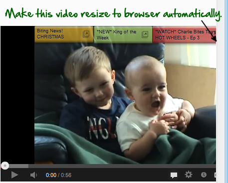
As you can see, the iframe gets wrapped insided a <div> element with a bottom padding equal to the exact aspect ratio of the video calculated by the script. The video will show in the original size initially and if the browser width is reduced,it will resize itself accordingly. You can check out this demo page showing the script in action.
Also See: How to backup your entire YouTube video channel to Google Drive.